Facebook Blue की कहानी: Zuckerberg का रंग चुनाव
Embed This Widget
Add the script tag and a data attribute to embed this widget.
Embed via iframe for maximum compatibility.
<iframe src="https://colorfyi.com/iframe/entity//" width="420" height="400" frameborder="0" style="border:0;border-radius:10px;max-width:100%" loading="lazy"></iframe>Paste this URL in WordPress, Medium, or any oEmbed-compatible platform.
https://colorfyi.com/entity//Add a dynamic SVG badge to your README or docs.
[](https://colorfyi.com/entity//)Use the native HTML custom element.
Few colors in digital history carry as much weight as Facebook blue. It appears on the screens of nearly three billion people every day, in one of the most recognizable interfaces ever built. Yet the origin of that particular shade of blue—and the reason it was chosen over any other color—is a story that begins not with a brand strategist or a color consultant, but with a medical condition affecting the platform's founder.
Mark Zuckerberg and Color Vision Deficiency
Mark Zuckerberg has red-green color blindness, a condition known clinically as deuteranopia or, more precisely in his case, a form of color vision deficiency that makes it difficult to distinguish certain wavelengths of red and green light. This affects roughly 8% of men of Northern European descent—a very common condition, though rarely the deciding factor in a billion-dollar brand decision.
Color vision deficiency occurs when one or more of the three types of cone cells in the retina—responsible for detecting long, medium, and short wavelengths of light—are either absent or function atypically. Red-green color blindness, the most common form, typically affects the M-cones (medium wavelength, most sensitive to green) or L-cones (long wavelength, most sensitive to red). For someone with this condition, reds and greens can appear as similar shades of yellow or brown, making them difficult to distinguish from each other.
What this means practically is that the world looks different to Zuckerberg than it does to most people—but blue looks the same. Blue occupies the short end of the visible light spectrum, processed by S-cones, which are unaffected by the most common forms of color blindness. In an interview with The New Yorker in 2010, Zuckerberg stated directly: "Blue is the richest color for me—I can see all of blue."
This is not the only reason Facebook is blue. But it is the starting point of a decision that has shaped the visual identity of global digital communication for two decades.
Why Blue Was Chosen
When Zuckerberg and his early collaborators were building the original Facebook interface in 2004, there was no formal brand strategy, no color psychology consultant, and no extensive market research. The design was a Harvard dorm room project. The color choice was personal and intuitive.
Blue offered several advantages beyond Zuckerberg's personal preference:
Trust and reliability: Research in color psychology consistently shows that blue is strongly associated with trust, competence, and stability. These associations are cross-cultural to a significant degree—blue is one of the few colors that polls favorably as a "trustworthy" color in surveys conducted across North America, Europe, and East Asia. For a platform asking users to share personal information, photos, and relationships, trust was a non-negotiable brand signal.
Screen legibility: Blue interfaces were well-established as readable and easy on the eyes for extended viewing sessions. White text on blue, or blue on white, produces clean contrast without the harshness of pure black-on-white at scale.
Differentiation from Google: In 2004, Google's identity was already well-established around its primary-color palette. Facebook's monochromatic blue stood apart from the multicolored logo approach, giving it a sense of institutional weight.
Neutral professional tone: Unlike red (which communicates urgency and excitement) or green (which carries strong associations with nature and finance), blue reads as professional without being stiff. It works equally well for a university student social network and a global communications platform—a useful flexibility as Facebook's ambitions expanded.
The Exact Blue: #1877F2
Facebook's brand blue has not always been the same value. The original interface used a color that is commonly described as approximately #3B5998—a medium, slightly desaturated blue that appeared in the navigation bars and header of the classic Facebook layout.
- Facebook Classic Blue:
#3B5998
This color remained the dominant brand expression through most of Facebook's growth from 2004 to the mid-2010s. It is the blue most users who grew up with Facebook associate with the platform—solid, reliable, slightly academic in its muted quality.
When Facebook underwent a significant redesign in 2019, moving to a cleaner, lighter interface with more whitespace and a refreshed visual hierarchy, the brand blue shifted meaningfully. The new primary brand blue is:
- Facebook Current Blue:
#1877F2
This is a notably different value. Where #3B5998 is darker and more desaturated—closer to a navy or corporate blue—#1877F2 is brighter, more saturated, and distinctly more vivid. In RGB terms:
#3B5998= RGB(59, 89, 152)#1877F2= RGB(24, 119, 242)
The new blue reads as a more confident, modern choice. It works better against the white-dominant redesigned interface. It also translates more effectively to mobile screens, where the higher saturation ensures the brand color remains distinctive at small sizes and in bright sunlight.
You can check how these blues perform in different contexts using the ColorFYI contrast checker—a critical test for any brand color used in digital interfaces.
WCAG Contrast of Facebook Blue
One important consideration for any brand blue is whether it provides sufficient contrast against white backgrounds to meet accessibility standards. For #1877F2 against white (#FFFFFF):
The WCAG 2.1 contrast ratio for #1877F2 on white is approximately 3.04:1. This meets the AA standard for large text (minimum ratio 3:1) but does not meet AA for normal-sized body text (minimum 4.5:1) or AAA for any text (minimum 7:1).
This means that Facebook's brand blue, used as a text color on white, requires attention to text size and weight. In practice, Facebook uses the blue primarily for interactive elements (buttons, links, navigation) rather than body text, and adjusts sizing accordingly.
For comparison, the older #3B5998 against white produces approximately 5.33:1—solidly AA compliant for normal text.
Facebook Blue vs. Meta Blue
In October 2021, Mark Zuckerberg announced that the parent company would be renamed Meta, with Facebook becoming one product within a broader portfolio that also includes Instagram, WhatsApp, and the nascent metaverse platform. The rebrand introduced a new visual identity for the parent company that uses a different palette from the Facebook blue.
- Meta Primary Blue:
#0064E0 - Meta Gradient: transitions from
#0064E0through#1ABCFE(a cyan-adjacent blue)
The Meta brand uses an infinity-symbol logo rendered in a gradient that moves from a deeper, slightly purple-adjacent blue into a brighter, cleaner blue. This is a deliberate visual step away from the flat, solid Facebook blue—it communicates dynamism, dimensionality, and a forward-looking technology orientation.
Importantly, the Facebook product itself retained its #1877F2 blue. The Meta rebrand was positioned as a corporate-level identity layer, not a product redesign. Users opening the Facebook app still see the familiar blue header; the Meta identity appears primarily in investor communications, corporate materials, and the Horizon Worlds metaverse product.
The distinction matters for brand color analysis. Facebook and Meta now have effectively separate color identities that serve different audiences: Facebook blue speaks to the three billion users of the consumer social platform; Meta blue speaks to investors, regulators, and the technology industry.
Blue in Social Media: Facebook's Influence
Facebook's success created a powerful precedent that influenced the color choices of subsequent social platforms. The dominance of blue in social media UX is at least partly attributable to the cognitive association that Facebook established between blue interfaces and social connectivity.
Twitter launched in 2006 and settled on a sky blue identity. LinkedIn, targeting professional networks rather than personal ones, chose a similar but more muted and corporate-adjacent blue. Tumblr used blue as a dominant UI color. Even platforms that differentiated themselves through other means often retained blue as a supporting UI color.
This blue dominance is not purely imitative—it also reflects the genuine psychological associations that make blue an appropriate choice for platforms asking users to communicate, share, and trust each other. But Facebook's early and dominant establishment of the color in the social media context certainly reinforced those associations.
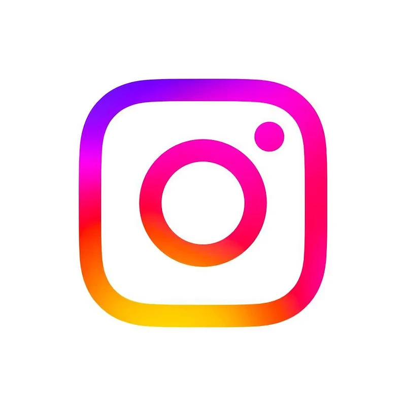
The exceptions are instructive: Instagram deliberately chose a colorful gradient identity (originally brown-and-yellow skeuomorphic camera, later a vivid sunset gradient) to position itself as a creative, visual platform distinct from Facebook's utilitarian blue. Snapchat chose yellow as its primary color—the most attention-grabbing hue in human vision—to communicate youthful energy and impermanence. TikTok chose black, signaling entertainment, nightlife, and video as its core medium.
Each of these color choices is partly a reaction to, and differentiation from, the blue social media establishment that Facebook created.
The Psychology of Blue at Scale
What makes Facebook's blue choice particularly interesting from a design psychology perspective is the way it functions at scale. The color appears billions of times per day, on devices ranging from flagship smartphones to old feature phones, from high-resolution desktop monitors to low-contrast screens in bright sunlight.
Blue is one of the most stable colors across different display technologies. Where reds can shift dramatically between sRGB screens and OLED displays, and greens can look different depending on the white point calibration of a monitor, blue tends to render more consistently. This stability is practically important for a platform that has no control over the devices its users choose.
Blue is also remarkably stable across ambient lighting conditions. In bright outdoor light, saturated blue remains distinctive and legible even when other colors become washed out. This matters for a mobile-first platform in global markets that include users in tropical and high-sun environments.
What Designers Can Learn
The Facebook blue story offers several lessons for designers and brand strategists:
Personal preference is a legitimate design input: Zuckerberg's blue was chosen partly because it was the color he could see most vividly. This accident of biology produced a brand color that turned out to be strategically effective. Personal intuition, when the person in question has good aesthetic sensibilities, can lead to better outcomes than over-engineered committee decisions.
Brand color transitions require careful management: The shift from #3B5998 to #1877F2 was significant enough to be noticed by long-term users but not so dramatic as to feel like a rebrand. The new color retained the same hue family while updating the value and saturation—a useful template for color evolution that feels like refresh rather than departure.
Platform-level and corporate-level colors can coexist: Meta's dual-color identity (Facebook blue for the product, Meta gradient blue for the corporate layer) demonstrates that large organizations can maintain distinct color identities for different audiences without confusion, as long as the contexts are clearly separated.
Accessibility matters for brand colors: #1877F2 is near but not consistently above the AA threshold for text contrast. Any designer using Facebook's blue as a reference should evaluate it against their specific use case using a contrast checker before applying it to text-heavy interfaces.
Key Takeaways
- Facebook blue originated partly from Mark Zuckerberg's red-green color blindness—blue is the color he sees most clearly and vividly.
- The original Facebook blue was
#3B5998, a darker, more desaturated navy; the current brand blue since the 2019 redesign is#1877F2, brighter and more saturated. #1877F2achieves approximately 3.04:1 contrast against white—meeting WCAG AA for large text but requiring careful application with normal body text.- Meta's rebrand introduced a separate corporate identity using
#0064E0and a gradient, while the Facebook product retained its established blue. - Blue in social media is partly a direct inheritance of Facebook's early dominance, and partly reflects blue's genuine psychological associations with trust, communication, and reliability.
- Use the ColorFYI contrast checker to verify how Facebook's blues perform in your own design contexts.