เหตุใด Starbucks จึงเลือกสีเขียว: เรื่องราวเบื้องหลัง Starbucks Green
Embed This Widget
Add the script tag and a data attribute to embed this widget.
Embed via iframe for maximum compatibility.
<iframe src="https://colorfyi.com/iframe/entity//" width="420" height="400" frameborder="0" style="border:0;border-radius:10px;max-width:100%" loading="lazy"></iframe>Paste this URL in WordPress, Medium, or any oEmbed-compatible platform.
https://colorfyi.com/entity//Add a dynamic SVG badge to your README or docs.
[](https://colorfyi.com/entity//)Use the native HTML custom element.
Walk into any city on earth and the green circle is immediately recognizable, even before you read a single word. Starbucks has achieved something extraordinarily rare in branding: a color so thoroughly claimed that it belongs, in the collective cultural imagination, to a single company.
But Starbucks green didn't begin as a calculated strategic choice. Like many of the most enduring brand colors, it evolved over decades, shaped by founders' instincts, cultural shifts, and a few pivotal redesigns. Understanding that history reveals as much about how colors become iconic as it does about Starbucks itself.
Origins of the Green: A Seattle Story
When Jerry Baldwin, Zev Siegl, and Gordon Bowker opened the first Starbucks in Seattle's Pike Place Market in 1971, the brand was not green. The original logo — designed by Terry Heckler — was a dark brown two-tailed siren (a Melusine figure from Norse mythology), set against a rough-hewn serif wordmark. The palette was earthy and wood-toned, appropriate for a store selling whole coffee beans out of burlap sacks.
Green entered the picture in 1987, when Howard Schultz acquired the company and began transforming it from a retail coffee shop into an espresso bar chain inspired by Italian coffee culture. The redesign updated the siren, cropped her tightly, and introduced a rich green as the dominant color of the mark.
Schultz has spoken about the green as a deliberate evocation of freshness, nature, and the Pacific Northwest environment where Starbucks was born. The forests, mountains, and rain-soaked greenery of Seattle became part of the brand's implicit promise: a return to something natural, unhurried, and grown with care.
Evolution of the Logo and the Color
The Starbucks logo has undergone four major redesigns, but the commitment to green has been consistent across all of them since 1987.
1971 — The Original: A brown, detailed illustration of the two-tailed siren. No green. Rustic, artisanal character.
1987 — The First Green Era: Schultz's acquisition brought the siren into a circular seal format with the full "Starbucks Coffee" wordmark. A rich, deep forest green replaced the brown as the primary brand color.
1992 — IPO-era Refinement: As Starbucks went public, the logo was cleaned up and the green slightly adjusted for reproduction consistency across an expanding store network.
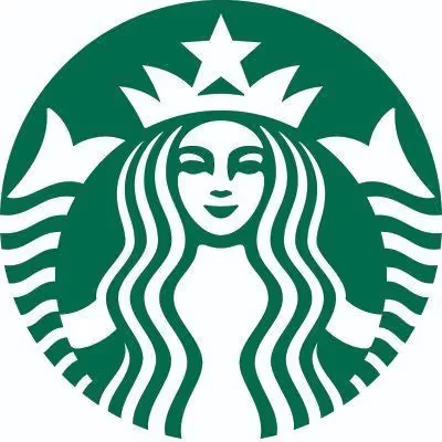
2011 — The Icon Stands Alone: For its 40th anniversary, Starbucks dropped the wordmark entirely, enlarging the siren to fill the circle and removing the outer ring of text. The green became even more prominent — the entire badge is now green with a white siren. The confidence required to eliminate your company name from your logo is extraordinary and reflects how thoroughly the color had done its communicative work.
The Exact Hex Code: #006241
The Starbucks brand green in digital applications is #006241 — a deep, cool-toned forest green with significant blue influence.
Let's look at its color properties:
- Hex:
#006241 - RGB: R: 0, G: 98, B: 65
- HSL: Hue 157°, Saturation 100%, Lightness 19%
- CMYK (approximate): C: 100, M: 0, Y: 34, K: 62
The color sits at the intersection of forest green and teal. It is deeply saturated, almost as saturated as a color can be at this lightness level. The zero in the red channel is notable — there is absolutely no red, giving the green a distinctly cool, confident character.
Starbucks also uses a lighter "Starbucks House Green" and an even lighter "Starbucks Light Green" for digital UI elements, but #006241 is the primary brand color that appears on cups, packaging, and the logo itself.
Contrast and Accessibility
On its signature dark green background, Starbucks uses white text and graphic elements. Testing #006241 against white (#FFFFFF) reveals a contrast ratio of approximately 7.5:1 — well above the WCAG AA threshold of 4.5:1 for normal text and 3:1 for large text. This is one reason the brand can use white text consistently across all surfaces without accessibility concerns.
Use the contrast checker to verify this and explore alternative combinations if you're working with colors in the same forest green family.
Brand Psychology: Why Green Works for Coffee
At first glance, green seems counterintuitive for a coffee brand. Coffee is brown — the color of roasted beans, espresso, and dark ceramic cups. Most heritage coffee brands of the 1970s and 1980s leaned into warm, earthy tones for exactly this reason.
Schultz's insight was that Starbucks wasn't selling coffee. It was selling a place — a "third place" between home and work — and an experience. Green carries associations that support this positioning powerfully:
Nature and freshness. Green is the color of living plants, and by extension, of ingredients grown in soil, under sun, tended by human hands. It implies that the coffee is fresh, the process is natural, and the origins matter.
Permission to linger. Green is psychologically calming. Unlike the urgent reds and yellows favored by fast-food brands (which are deliberately stimulating to encourage faster customer turnover), green signals that you may slow down. It invites relaxation.
Environmental responsibility. By the 1990s and especially by the 2000s, green had accumulated powerful associations with environmentalism and sustainability. Starbucks has leaned into this, investing heavily in ethical sourcing programs and environmental initiatives. The color reinforces the messaging.
Aspiration. Deep, saturated greens have long been associated with wealth and quality in Western design traditions — think of British racing green, the felt of billiard tables, or the deep greens of fine bookbinding. Starbucks green carries a hint of this aspiration, subtly signaling that this is not an ordinary commodity.
The Siren and the Color Together
The logo's other element — the two-tailed mermaid — interacts with the green in important ways. The siren is a figure of mythological allure, drawing sailors toward her. Against the deep green background, the white siren becomes a vision: luminous, slightly ethereal, standing against the deep forest-sea color.
The combination is unusual enough to stick in memory. A photograph of coffee beans would be forgettable. A white siren on deep green is specific, strange, and memorable — which is precisely what a brand logo should be.
Green in the Food and Beverage Industry
Starbucks' success with green has influenced how the entire specialty coffee and food industry uses color.
Before Starbucks, green was relatively uncommon in global food-service branding. The dominant logic was that warm colors — reds, oranges, yellows — stimulate appetite and urgency, the qualities that drive transaction volume. Green was considered a "cool" color that could read as artificial (think of the artificial mint greens used in mid-century design) or overly clinical.
Starbucks demonstrated that green, used richly and consistently enough, could communicate quality rather than artificiality. The explosion of "natural," "organic," and "artisanal" food branding that followed in the 2000s and 2010s leaned heavily on greens — from Whole Foods to dozens of health food brands — building directly on the emotional vocabulary that Starbucks had established.
The distinction that kept Starbucks' green from becoming generic is its depth. Many imitators used light, bright, or lime greens. Starbucks maintained a commitment to its specific deep, cool-toned forest green — a color that reads as mature and confident rather than trendy or health-fad-adjacent.
Regional Variations and the Global Green
One of the most remarkable aspects of Starbucks green is how successfully it has traveled across cultures.
In many East Asian markets, green carries strong positive associations with nature, health, and harmony. In Western markets, green's associations with environmentalism have only strengthened over the past two decades. In Middle Eastern markets, green carries deep cultural and religious significance — it is a sacred color in Islam, associated with paradise and the Prophet.
Starbucks navigated these varied associations by keeping the brand mark relatively neutral: the siren is a non-religious, non-cultural figure, and the green is natural enough to read as nature-positive across contexts. The company has opened stores in over 80 countries using the same logo and the same green, a feat of cross-cultural branding that is genuinely rare.
The Green Cup and Beyond
The Starbucks red holiday cup has become a cultural touchpoint in the United States — and occasionally a controversy. But the standard Starbucks cup is, of course, white with the green logo. This pairing has become so culturally embedded that it is used as a visual shorthand in film and television to signal "affluent urban professional," "morning commute," or simply "coffee" without a single word of dialogue.
The color #006241 has moved beyond brand asset into cultural artifact — a rare achievement that only the most committed and consistent brand-building efforts produce.
Key Takeaways
- Starbucks green entered the brand in 1987 when Howard Schultz acquired the company and reoriented it toward the Italian espresso bar experience, with green evoking the natural, Pacific Northwest environment.
- The primary Starbucks brand green is #006241 — a deep, cool-toned forest green with zero red in its RGB values, giving it a distinctive cool confidence.
- The 2011 redesign removed the wordmark entirely, making the green circle and white siren alone sufficient for global recognition — a testament to decades of color consistency.
- Psychologically, green works for Starbucks because it signals nature and freshness, permission to linger, environmental responsibility, and a degree of aspiration — none of which would be communicated by the warm reds and yellows favored by fast-food competitors.
- The contrast ratio of #006241 against white is approximately 7.5:1, comfortably exceeding WCAG AA accessibility standards.
- Starbucks' success established a template for using deep, rich greens in premium food and beverage branding that has influenced an entire generation of brands.
- Use the contrast checker to test green-on-white and white-on-green combinations if building in the Starbucks color family.