Gradient Design Trends: From Flat to Dimensional
Embed This Widget
Add the script tag and a data attribute to embed this widget.
Embed via iframe for maximum compatibility.
<iframe src="https://colorfyi.com/iframe/entity//" width="420" height="400" frameborder="0" style="border:0;border-radius:10px;max-width:100%" loading="lazy"></iframe>Paste this URL in WordPress, Medium, or any oEmbed-compatible platform.
https://colorfyi.com/entity//Add a dynamic SVG badge to your README or docs.
[](https://colorfyi.com/entity//)Use the native HTML custom element.
The history of gradients in interface design is a story of overcorrection. Gradients were everywhere in the early web — heavy, glossy, skeuomorphic. Then flat design wiped them out. Then designers grew bored with flat design and brought gradients back, but subtler, more sophisticated, more intentional. Today, gradients are central to some of the most celebrated visual identities and interfaces in the world, from Stripe's mesh backgrounds to the generative color flows of high-end SaaS products.
This guide traces that arc and equips you with the technical and aesthetic knowledge to use modern gradient techniques confidently.
History of Gradients in Web Design
The Skeuomorphic Era (2000s – early 2013)
Early web design borrowed heavily from physical objects. Buttons needed to look like real buttons — with gloss reflections, drop shadows, and beveled edges. Gradients were indispensable tools in this approach. A button might have four distinct gradient layers: a radial highlight near the top, a linear gradient from the brand color to a darker shade, an inner glow, and a subtle outer shadow.
iOS before version 7 is the canonical reference. The original App Store icon was a pure blue-to-white radial gradient with a glass sphere overlay. Apps like Calculator and Compass were modeled on physical instrument aesthetics, with heavy gradients simulating metal, leather, and felt.
This approach had real merits — users knew what buttons looked like because they looked like things they had touched before. But it aged quickly and required significant design effort per element.
The Flat Design Revolution (2013 – 2015)
Windows Phone's "Metro" design language and iOS 7 (launched September 2013) announced the end of skeuomorphism as the dominant paradigm. Gradients almost entirely disappeared. Everything became solid colors, hairline borders, and generous whitespace.
The theoretical argument was clean: decoration that serves no communicative function should be removed. A button communicates its interactivity through position, contrast, and convention — not through a gradient simulating depth. Flat design's strengths were real: it transferred better across screen sizes, loaded faster, and aged better than glossy skeuomorphic assets.
But flat design had its own problems. Without visual depth cues, complex interfaces became hard to parse. Buttons were hard to distinguish from static text. Cards blurred into each other. By 2015, "almost flat" or "material design" began addressing these gaps.
Material Design and Long Shadows (2014 – 2016)
Google's Material Design (2014) reintroduced the z-axis to flat design. Elements could be layered, cast shadows, and respond to light — but the light source was abstract and consistent, not photorealistic. Gradients crept back in as shadow systems: subtle bottom-weighted shadows that established depth without the Photoshop-layer complexity of the skeuomorphic era.
Long shadow design — a brief but visible trend in icon design — used 45-degree shadows extending far beyond the object. It was essentially a gradient disguised as a shadow.
The Gradient Renaissance (2016 – present)
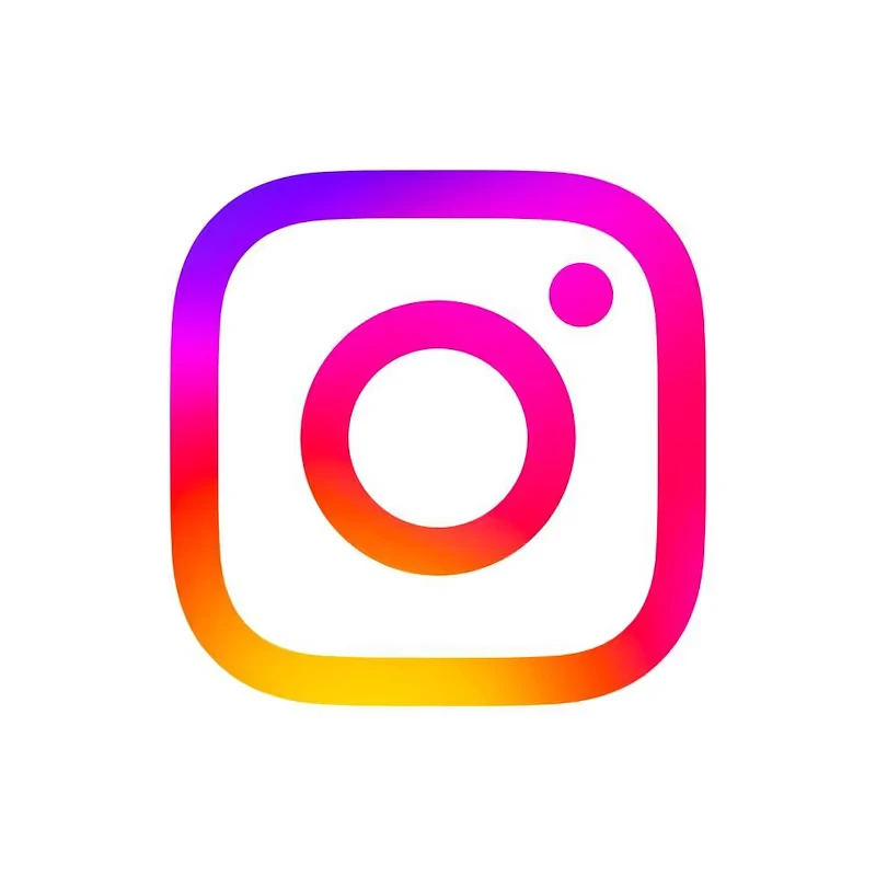
Instagram's 2016 logo rebrand marked the symbolic return of the gradient. The new icon — a gradient sweeping from yellow-orange through pink to purple — was divisive at first but proved influential. It demonstrated that gradient could function as identity, not just decoration.
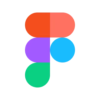
Spotify, Stripe, Figma, and Notion all incorporated gradients into their visual systems over the following years. But these were not the heavy chrome gradients of 2008. They were luminous, airy, and abstract — color as atmosphere rather than simulation.
Mesh Gradients: The Defining Trend of the 2020s
Mesh gradients represent the most significant evolution in gradient design since linear and radial types were codified. Instead of interpolating between two points along a single axis (linear) or from a center point outward (radial), a mesh gradient places color anchor points at arbitrary positions across the canvas and interpolates smoothly between all of them.
What Makes Mesh Gradients Different
A conventional linear gradient blends from #6366F1 (indigo) to #EC4899 (pink) along a single line. The result is a smooth but simple one-dimensional transition.
A mesh gradient with four anchor points might place:
- Deep violet #4C1D95 at the top-left
- Cyan #06B6D4 at the top-right
- Rose #F43F5E at the bottom-center
- Amber #F59E0B at the bottom-right
The result is a two-dimensional color field where hues bleed and pool in organic, unpredictable ways. No two mesh gradients look quite alike, and the organic quality makes them feel hand-crafted even when generated algorithmically.
Applications of Mesh Gradients
Hero backgrounds. Full-bleed mesh gradients as page backgrounds create atmosphere without requiring photography. Stripe's homepage has used various iterations of animated mesh gradients for years, establishing a brand signature.
Card fills. Gradient-filled cards with white or light text create visual hierarchy without borders or shadows.
Abstract "blobs." Radially-masked mesh gradients are used as abstract shapes layered behind interface elements, creating a sense of spatial depth.
Brand illustrations. Gradient-filled abstract shapes have replaced flat icon sets in many design systems, adding visual energy without representational complexity.
Generating Mesh Gradients
CSS does not natively support mesh gradients as of 2025. Common approaches include:
- SVG with
<feGaussianBlur>filters: Colored circles blurred and composited - Canvas API: Direct pixel-level interpolation with JavaScript
- Dedicated tools: Figma's mesh gradient plugin, online mesh gradient generators
- CSS layered radial gradients: Multiple semi-transparent radial gradients stacked can approximate a mesh effect
Use the gradient generator to experiment with multi-stop gradients and combinations as a starting point.
Glassmorphism and Frosted Glass
Glassmorphism emerged as a named trend around 2020–2021, though its roots are in earlier Apple design work. The effect simulates frosted glass: a semi-transparent panel with a blurred view of whatever is behind it, a faint border on the bright side, and subtle inner shadow.
The Visual Components
A glassmorphism card combines several layers:
- Background blur:
backdrop-filter: blur(12px)blurs the content behind the element - Semi-transparency:
background: rgba(255, 255, 255, 0.15)lets the blurred background show through - Border highlight:
border: 1px solid rgba(255, 255, 255, 0.25)simulates the refraction of light at glass edges - Subtle shadow:
box-shadow: 0 8px 32px rgba(0, 0, 0, 0.12)grounds the element
The effect works best against a colorful background — a mesh gradient, a photograph, or a vivid solid color. Against white, the semi-transparent panel is nearly invisible.
Glassmorphism and Color
Color choices matter enormously for glassmorphism. The panel inherits color from whatever is behind it. Designers typically control the background gradient carefully to ensure the glass surface takes on appealing tints.
A background combining deep blue #1E3A8A and indigo #4338CA will produce a panel with cool blue-purple undertones. A warm background of amber #D97706 and orange #EA580C produces warm-tinted glass.
Accessibility Concerns
Glassmorphism presents real accessibility challenges. Semi-transparent text over a blurred gradient background makes contrast ratios variable and hard to guarantee. As the background shifts behind a scrolling or animated panel, contrast may change dynamically.
Design glassmorphism layouts so that text appears only over sections of background that maintain sufficient contrast. A dark enough semi-transparent overlay and light text can achieve consistent contrast, but it requires careful calculation rather than visual estimation.
CSS Gradient Techniques
Understanding the CSS gradient syntax gives you precise control over modern gradient effects.
Linear Gradients
/* Two-stop */
background: linear-gradient(135deg, #6366F1, #EC4899);

/* Multi-stop with custom positions */
background: linear-gradient(
  to bottom right,
  #06B6D4 0%,
  #6366F1 40%,
  #EC4899 100%
);
The angle (135deg, to bottom right) controls the gradient direction. Multiple color stops with explicit positions create uneven distributions — useful for emphasizing one color over another.
Radial Gradients
/* Circular radial from center */
background: radial-gradient(circle, #F59E0B, #EF4444);

/* Elliptical, off-center */
background: radial-gradient(ellipse at 30% 20%, #3B82F6, #1E3A8A 70%);
Radial gradients are especially effective for spotlight or bloom effects. An off-center elliptical radial creates the "light leaking in from a corner" effect common in atmospheric UI design.
Conic Gradients
/* Color wheel */
background: conic-gradient(from 0deg, #EF4444, #F59E0B, #10B981, #3B82F6, #8B5CF6, #EF4444);
Conic gradients rotate around a central point rather than transitioning across a plane. They are less common in mainstream UI but appear in pie charts, color wheels, and distinctive decorative elements.
Layered Radial Gradients (Mesh Approximation)
background:
  radial-gradient(circle at 20% 30%, rgba(99, 102, 241, 0.8) 0%, transparent 50%),
  radial-gradient(circle at 80% 10%, rgba(236, 72, 153, 0.7) 0%, transparent 45%),
  radial-gradient(circle at 60% 80%, rgba(6, 182, 212, 0.6) 0%, transparent 55%),
  #0F172A;
Stacking multiple semi-transparent radial gradients approximates the appearance of a mesh gradient. The dark solid base (#0F172A) provides a background against which the color blooms appear. This technique is pure CSS, works everywhere, and is surprisingly effective.
Hard-Stop Gradients
/* Color blocking — no blend */
background: linear-gradient(to right, #EF4444 50%, #3B82F6 50%);

/* Diagonal split */
background: linear-gradient(135deg, #F59E0B 49.9%, transparent 50%),
            linear-gradient(135deg, transparent 50%, #0F172A 50.1%);
Setting the transition point between the same position on two adjacent stops creates a hard edge — a "cut" rather than a blend. This geometric approach was popular in editorial design and branding work around 2017–2019 and continues to appear in bold brand applications.
Modern Gradient Tools and Generators
Generating Base Gradients
The gradient generator on ColorFYI lets you define start and end colors, control the angle and color stops, and preview the result instantly. It is the fastest way to find gradient combinations that work before committing to a design.
Start by selecting two colors that are harmonious but distinct:
- Analogous pairs (hues adjacent on the color wheel) produce smooth, natural-looking gradients. #3B82F6 (blue) to #8B5CF6 (violet) flows naturally because the hues share similar spectral neighbors.
- Split-complementary pairs produce more dramatic gradients with more visual tension. #EF4444 (red) to #3B82F6 (blue) spans a wide hue arc and feels energetic.
Choosing Gradient Colors
Not all color pairs make good gradients. The middle transitions matter as much as the endpoints. Two complementary colors — directly opposite on the color wheel — often produce a muddy, desaturated middle band when blended. Red and green blend through brown. Blue and orange blend through brownish gray.
Solve this by routing the gradient through a more saturated intermediate stop:
/* Avoids muddy green-brown midpoint */
background: linear-gradient(135deg, #EF4444, #EC4899, #8B5CF6);
Adding a magenta or violet mid-stop between red and purple keeps the energy vivid throughout.
Design Patterns Worth Knowing
Gradient text: Applied with background-clip: text and color: transparent, gradients on text create a vibrant effect popular in headings and logos.
Gradient borders: Achieved with border-image, or more flexibly with a pseudo-element background behind a clipped container.
Animated gradients: background-position animation on an oversized gradient background creates a slow color flow effect. The "aurora" trend popularized this for hero sections.
Key Takeaways
- Gradients have moved through skeuomorphism, flat design, and back to dimensional richness — each era refined what came before rather than simply reversing it.
- Mesh gradients place color anchor points at arbitrary positions, producing organic, non-linear color fields that feel handcrafted; CSS approximates them through layered radial gradients.
- Glassmorphism combines
backdrop-filter: blur, semi-transparent backgrounds, and bright borders to simulate frosted glass — powerful but demanding careful contrast management. - CSS supports linear, radial, and conic gradients, plus multi-stop and hard-stop variations for geometric effects.
- Avoid desaturated midpoints between complementary colors by adding a third stop that routes through a more vivid hue region.
- Use the gradient generator to quickly experiment with stop positions, angles, and color combinations before building in code.
- Animated gradients, gradient text, and gradient borders extend the technique from backgrounds into typography and UI components.